

Creating it
It’s not something you dash off on the back of a napkin: a style guide is created in conjunction with the person in charge of graphic design and anyone else responsible for the business’s visibility to the public. The graphic designer must have a good understanding of the company’s services, but also know what image it wants to project to its audience.
A style guide normally includes:
- The logo and its usage rules (or logotype, if the logo is made up of letters, like FedEx).
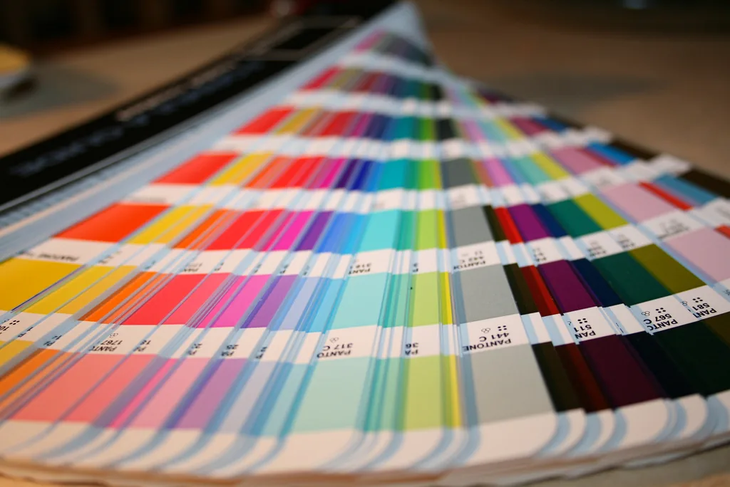
- The colour code. Specific colours are generally provided (defined with a Pantone code), and only those colours should be used.
- The fonts to use in official documents.
Tips
To convey your intentions to the company managers who will consult the style guide, writing a text that sums up the intentions behind the creation of the visual identity can be an excellent initiative. Among other things, it can explain the meaning of the logo and the choice of colours used in creating it.
Examples
Just look around and you can already see the benefits of a style guide.
- Can you imagine Pepsi using its logo only in red and white? That would be enough to make consumers confuse it with its competitor, Coca-Cola!
- Would you be tempted to go to McDonald’s if it replaced the famous golden yellow of its logo with green? It might just put you off!
So we can say that a style guide reinforces the message a company wants to convey to consumers.
Here are two concrete examples from the Montréal area: the city’s two French-language universities.
- Around the turn of the 2000s, the Université du Québec à Montréal (UQAM) treated itself to a new logo, courtesy of renowned designer Frederic Metz. All eyes immediately turned to the grave accent over the A, a decision the public found bold because “UQÀM” isn’t normally written that way. The grave accent was meant to reaffirm UQAM’s place as a major French-language public university in Canada. It is therefore unthinkable for anyone authorized to use the UQAM logo to use it without its acute accent or its blue colour.
- Around the same time, its counterpart on the mountain was also searching for its identity. The publications of the various departments making up the Université de Montréal lacked graphic unity: nothing looked alike. The Université de Montréal’s Bureau des communications et des relations publiques therefore introduced a very precise standards guide (available to everyone). By unifying all the communications issued by all of the university’s entities, this change proved beneficial for the university’s brand as a whole.
—
Need help with your company’s branding? Don’t hesitate to contact us to learn about our services!